Kirby Meets Masonry
The Masonry jQuery Plugin by David DeSandro is one of the most-used jQuery plugins these days when it comes to arranging pictures with various dimensions. No matter if you have a mixture of landscape, portrait and square pics, the plugin will always figure out, how to arrange them best in a nice grid.
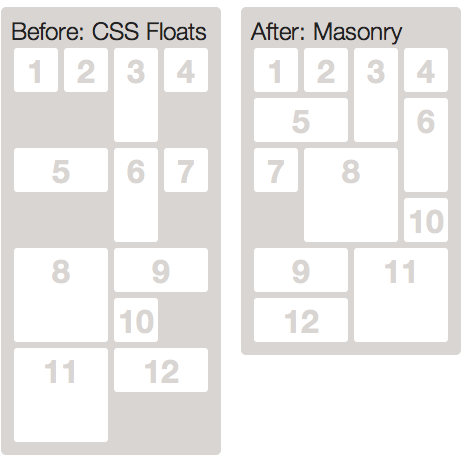
It looks like magic but actually it is very easy to implement. I've prepared a little demo for you so you get a better idea of it.
The following tutorial will show how to use it with your Kirby-flavoured site.
The Images
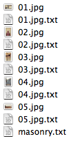
Add a row of images to one of your content folders. If you want to add additional information to each image, like a caption or additional link, just place another text file to each image with the exact name of the image file.
Here's an example of one of my image text files:
Title: India
----
Link: http://www.flickr.com/photos/pfedo/4359569700/in/set-72157623439493734
I will show you later how to access the additional info from those image text files.
A new template
In this case I've called the main content file masonry.txt so I can add a new template for the page:
site/templates/masonry.phpThis will make it possible to create our custom HTML for the image gallery in that new template.
The HTML
The HTML for a masonry-powered image grid is rather simple. A unordered list with images will do the trick:
<div id="masonry">
  <ul>
    <?php foreach($page->images() as $pic): ?>
    <?php $pic->fitWidth(200) ?>
    <li>
      <img src="<?= $pic->url() ?>" width="<?= $pic->width() ?>" height="<?= $pic->height() ?>" />
    </li>
    <?php endforeach ?>
  </ul>
</div>
Giving the wrapping div the id "masonry" will make it easier to call the plugin later. The wrapping div will also help to keep the floats under control. You will see that later in the CSS for this example.
A specialty here is…
<?php $pic->fitWidth(200) ?>… in the first row of the foreach loop. This will take care of recalculating the image dimensions to a width of 200 pixels. This does not actually resize the image file, but just recalculate the dimensions by keeping the original ratio. Of course it is better to make sure that all images have an original width of 200 pixels, but sometimes it is easier to let the browser scale them down slightly. It's up to you how you set the width for your images. Just make sure to match the width in your HTML with the width in your CSS.
It's important to specify the width and height for the img tag. Otherwise the plugin will have a hard time to render the image grid properly.
If you want to add the additional info from your image text files you can do it like this for example:
<div id="masonry">
  <ul>
    <?php foreach($page->images() as $pic): ?>
    <?php $pic->fitWidth(200) ?>
    <li>
      <a href="<?= $pic->link() ?>" title="<?= $pic->title() ?>"><img src="<?= $pic->url() ?>" width="<?= $pic->width() ?>" height="<?= $pic->height() ?>" alt="<?= $pic->title() ?>" /></a>
    </li>
    <?php endforeach ?>
  </ul>
</div>
You can access all the custom variables, which you've added to the image text files like you would with all custom variables in the content file of each page. You can find more about it in the docs.
The CSS
Add the following lines to the stylesheet for your site.
#masonry {
  overflow: hidden;
  width: 860px;
  padding: 50px 0;
}
#masonry ul {
  width: 900px;
}
#masonry li {
  float: left;
  list-style: none;
  width: 200px;
  margin-right: 20px;
  margin-bottom: 20px;
  line-height: 0;
}
The CSS for this example is very straight forward. You must use simple floats for the original layout and the plugin will take care of rearranging the floats afterwards.
I've setup the masonry div to a width of 860px. That's four 200px images per row with a 20px gutter. I use margin-right to create the gutter, which will also create a fourth margin on the last image in a row. Normally this would break the float for the last image. By giving the unordered list a width which is bigger than 860px it will make sure that there will always be enough space for four images in a row despite the additional margin. The wrapping "masonry" container has the desired width of 860px and with overflow: hidden it will take care of keeping control of the floats and also of hiding the additional space on the right, which is created by the unordered list.
This trick works very well in all browsers down to IE6. The only downside is when you have to work with shadows for example which would reach outside of the wrapping "masonry" container and will be cut that way.
The Javascript
Make sure to download the latest version of David's Masonry script here: http://masonry.desandro.com/jquery.masonry.min.js and add it to your site's script folder. I always use the folder assets/js for all my javascript files, but it is up to you to add it wherever you like. Also make sure to load the latest version of jQuery. I'm using the Google JS API to load the latest version from the Google CDN.
Add the following lines to the header snippet of your site.
<?= js('http://ajax.googleapis.com/ajax/libs/jquery/1.7.1/jquery.min.js') ?>
<?= js('assets/js/jquery.masonry.js') ?>
You will need an additional script tag in your template or an additional script file where you initialize the masonry plugin. Making it work is very easy:
$(function(){
  $('#masonry ul').masonry();
});
If you are using an additional script tag right inside your HTML template, make sure that the script tag is placed below the HTML of your image list.
You will find loads of additional options and information on the Masonry site.
That's it! Now you should have a nice Masonry+Kirby-powered grid for your images.
PS
I'm using the shuffle() method for the demo, so the layout changes on every page view. Read more about it in the tutorial about random content.